SchoolMate
empowering families
with insightful choices
This case study explores the creation Schoolmate - an app designed to simplify the school search process for families. Through competitive analysis, interviews and surveys, feature ideation, and usability testing, a high-fidelity prototype was developed to empower parents to make confident, data-driven decisions with a comprehensive and accessible solution.
Client
Flatiron school
[concept project]
role
UX Researcher
UX/UI Designer
timeline
3 weeks
methodologies
• SWOT Analysis • MVP Prioritization (MoSCoW) • Affinity Mapping • Card Sorting • Lean UX Canvas • kano Model • Heuristic Evaluation • Value Proposition Canvas • Empathy Mapping
contents
Objective
the goal
About the brief
research
identifying the audience
Competitor analysis
defining the problem
concept
Concepts
Features & protoypes
User testing
goal
Create an experience that allows parents to find schools where they would feel confident enrolling their children.
in the complex journey of finding the right school, families rely on a mix of research, personal visits, and that elusive 'gut feeling'
SchoolMate was born out of the need to support this intuitive process with
tangible, data-driven insights
with SchoolMate, families have a companion in the decision-making journey, providing them with support and assurance
the goal
my goal was to create an experience for parents to find schools where they would feel confident enrolling their children.
However, in order to best solution for this, i needed to get a better understanding of who our audience was, what was available on the market today, and what families really needed when searching for schools.
This began our journey to creating SchoolMate.
the school searchers
The first question i needed to answer in order to solve for our goal:
who exactly needs to search for schools? Who are our users?
To answer this - i took two key steps…
starting with a survey
I surveyed 15 total users to get insight on their current or previous school search experiences.
The survey was broken into 3 sections: demographic, search experience, and touring, plus a screener prior to ensure the results were relevant and useful.
-
We asked basic demographic related questions to get a better understanding of the types of users who may need a school search app.
-
Here we asked questions to get an idea of how users felt about their search for schools. Where did they experience pain points or friction?
-
Here, we asked users about their tour experiences and how this influences their final decision
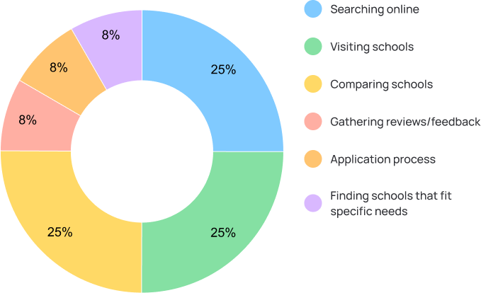
what was the most time consuming part of your search?
12 responses
-
When it comes to the most time consuming part of the school search experience, the top complaint from 25% of the 12 responses we received were about:
Searching for schools online
Touring/visiting schools
Comparing schools to make a final decision
This meant we needed to make it easier for parents to search for schools, schedule tours, and compare schools.
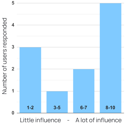
how much influence did touring have on your decision?
11 responses
-
When it comes to touring schools, we learned that physically visiting each school is a highly influential part of the decision making process. 7 of the 11 responses we received were from users claiming that the tour was influential to extremely influential (above neutral), which is about 77% of responses to this question.
This showed us how important it is to make it easier for families to tour schools.
talking to families
I HAD inherited 6 pre-conducted interviews, where users were asked questions about their previous school search experiences.
In these interviews, users re-affirmed the data from the survey results, specifically around the importance of touring a school and searches that take way too long.
these interviews also highlighted how important it is to trust your intuition when selecting a school. 5 of the 6 candidates interviewed made a mention that, while they searched, compared, toured, got feedback from friends and family - the choice ultimately came down to their “gut instinct”
“it really was a gut feeling, the kids were proud, and comfortable in their own skin. I knew that’s where I had to send my daughter.”
“our gut reaction was positive, and I usually do make decisions like that.”
“the most important thing is to follow your instinct. You know your child best…”
“intuition counts for a lot”
insights that defined our journey
1. Searching for schools needs to be made easier and faster
2. Touring a location is the most influential aspect of the school search process
3. when making their final choice, Parents trust their gut instinct over all other resources and feedback
the current market landscape:
looking at our competitors
WITH A BETTER UNDERSTANDING OF who our users are, I wanted to see what types of solutions are available to users today.
We looked at a number of different competitors, such as other school finders (niche.com & greatschools) however we also extended our reach to other child care platforms like care.com
hits
MANY OF THE SOLUTIONS AVAILABLE TODAY offer basic features such as searching/filtering - so this was something we wanted to include on our MVP (most viable product) as it is an industry standard and an expectation from users
misses
Something I saw lacking in the market is the ability to easily schedule tours and manage personal feedback from tours. since touring is what allows users make their “gut” choice, users need a tool that allows them to quantify their “gut” feedback so that they have tangible data to reflect on when making their final choice of school
the real problem
parents looking to enroll their children into private school need a way to schedule tours to visit locations, compare schools tours against each other, and rank their top school choices in order to feel confident that they will be selecting the best school for their child.
defining our mvp: prioritizing with mscw
there are many things we can include in a web and mobile app that can address these pain points, however, in order to get our solution into the hands of users quickly, I needed to outline the most vialble version of our product. I started by outlining a long list of potential features - once all our ideas were brainstormed, I organized everything into an mscw list to identify THE must have, should have, could have, and won’t have ideas.
must haves
standard school Search and filter
ability to Schedule tours
ability to collect tour feedback and customize requirements
Ability to compare your tour scores against each other
-
Refined filter and search
Parent feedback/reviews
Reschedule & cancel tours in app
-
School match-maker quiz
Compare schools (pricing, education styles, etc)
See top rated schools from all users
-
Perfect tour scheduler
Optimized tour route via location
Tour weather alerts
lo-fi to mid-fi: starting with sketches and ideas
Now that we know what features we wanted to focus on for our MVP - we were able to start sketching AND DESIGNING IN LOW FIDELITY.
many layout choices were considered when creating the general structure of the app - the first task was to make scheduling tours simple, fast and easy. So when creating the calendar experience i took some references from Calendly, as their scheduling features have a very clean and intuitive user experience. Everything within the app needed to be easy to find, easy to get to, and easy to utilize and navigate.
we ultimately decided the sketches FOR the search, schedule, and feedback views. OVER MANY ITERATIONS and with input from our users and stakeholders.
fROM HERE, I WAS ABLE TO MOVE INTO MID-FIDELITY DESIGNS SO THAT we can further refine how the product would look, feel and behave.
creating an intentional user interface
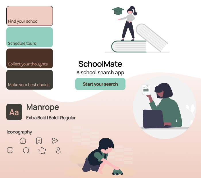
now it was time to start considering how Schoolmate was going to look and feel, making choices relating to the color palettes, typography, iconography, and other visual design elements - it was important that these choices were made with with carefully consideration, as these elements set the tone for the schoolmate experience.
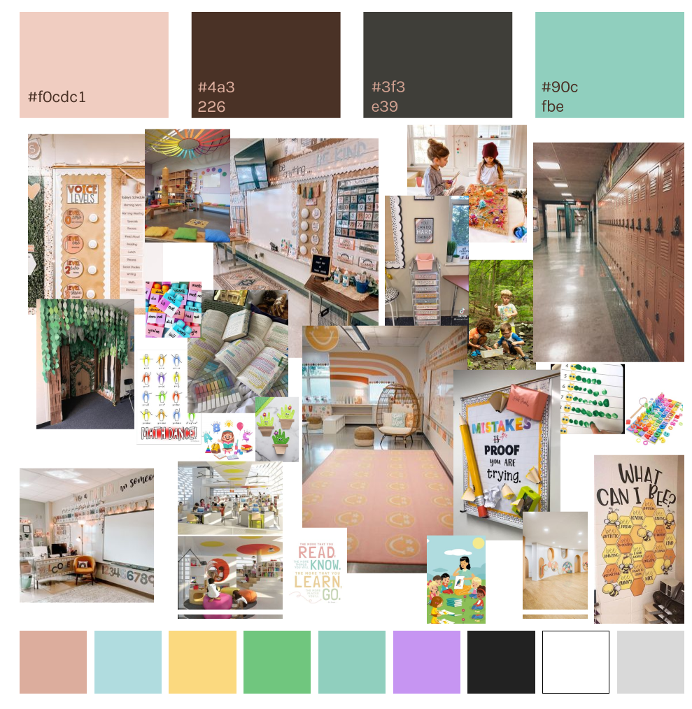
as a first step, I put together a moodboard in order to visually articulate the desired aesthetic, style, and theme of the project - the moodboard served as my reference and source of inspiration for the rest of design process.
considering that schoolMate operates within the realm of education-oriented services, I started looking at images of classrooms, and other education related spaces. I noticed that Many of these spaces utilize soft pastel tones that evoke a sense of warmth and comfort, reflecting a nurturing environment associated with learning and growth. I wanted schoolmate to reflect exactly that and give the user a sense of comfort, care, and safety.
typography
rounded and organic fonts offer a comfortable reading experience that aligns with the design philosophy and style
imagery
peachy pink hues, soft gradients, and subtle wave motifs aim to evoke feelings of safety, care, and tranquility
iconography
soft-edged, rounded icons reinforces the app's theme of safety and comfort, providing a visually pleasing experience
accessibility
thorough testing, focusing on readability, usability, and user feedback ensures the app is accessible to all
the hi-fi mvp - how it all came together
here you can see some examples of the final implementation of everything that was considered, tested, researched, and prioritized for the MVP:
accessibility and ease of use were top of mind when translating the mid fidelity experience into high fidelity.
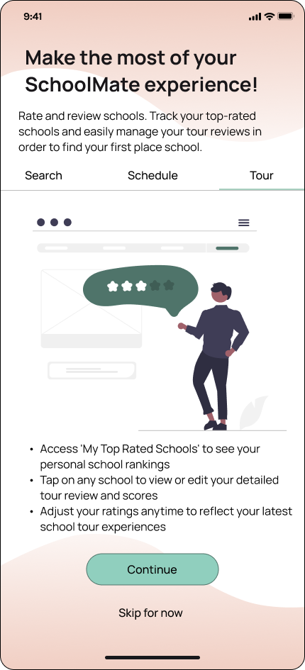
we start with a clear and simple splash page, users can sign up as a new user or log in as a returning user. if logging in for the first time, the user is taken through a quick onboarding flow so that we can introduce the schoolmate experience and allow our users to fully utilize the tool.
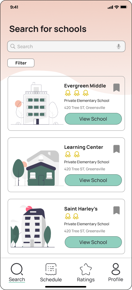
returning users will land directly on the search page - here users can view and filter through schools, select a school profile to see more information, and schedule a tour at the location.
once a tour is scheduled, users will be able to see their tour schedule, organized by tours scheduled today, upcoming tours, and past tours. once the tour time has passed, users are then able to rate their tours.
the rankings page is where we can help users translate that illusive ‘gut feeling’ into real, tangible data that users can weigh their decision making against. Either while on the tour or after, users can review different aspects of the school and give a 1-5 star rating. Users can add or edit fields as needed so that they can be sure they are accounting for what is most important for them (for example, location may not be a factor for some, while others consider location to be very important).
Once the form is filled out, the app will provide a accumulative/overall score for the school and add it to your rankings list. depending on the overall score each school, we will be able to show the user their top school based on their own rankings.
on the final rankings page - the top 3 schools are highlighted in order to make decisioning making easier on users, as too many choices can induce decision making fatigue. should feelings change in the future, users are able to go in and edit their tour scores and school ranking at any time.
this data will help users to reflect on their priorities when selecting a school, and provide the peace of mind that is so needed during the school search and application process. Instead of solely trusting a gut instinct, users now have real data to consider when selecting their best school.
perfection and reflection
the journey of School Mate began with a simple goal: to make the school search process easier for parents. Through user research and feedback from parents who have experienced the search process before, we discovered the importance of simplifying the search process and prioritizing the tour experience. With SchoolMate, families can quantify their gut feelings by scoring an rating every school tour, empowering them to make informed decisions.
Our journey with School Mate has been enlightening, and i am grateful for ability to reflect on the invaluable lessons learned, for the growth i experienced and for the opportunity to expand my understanding of user needs and design principles. Moving forward, i carry these insights with me and will be ready to apply in the future.


